

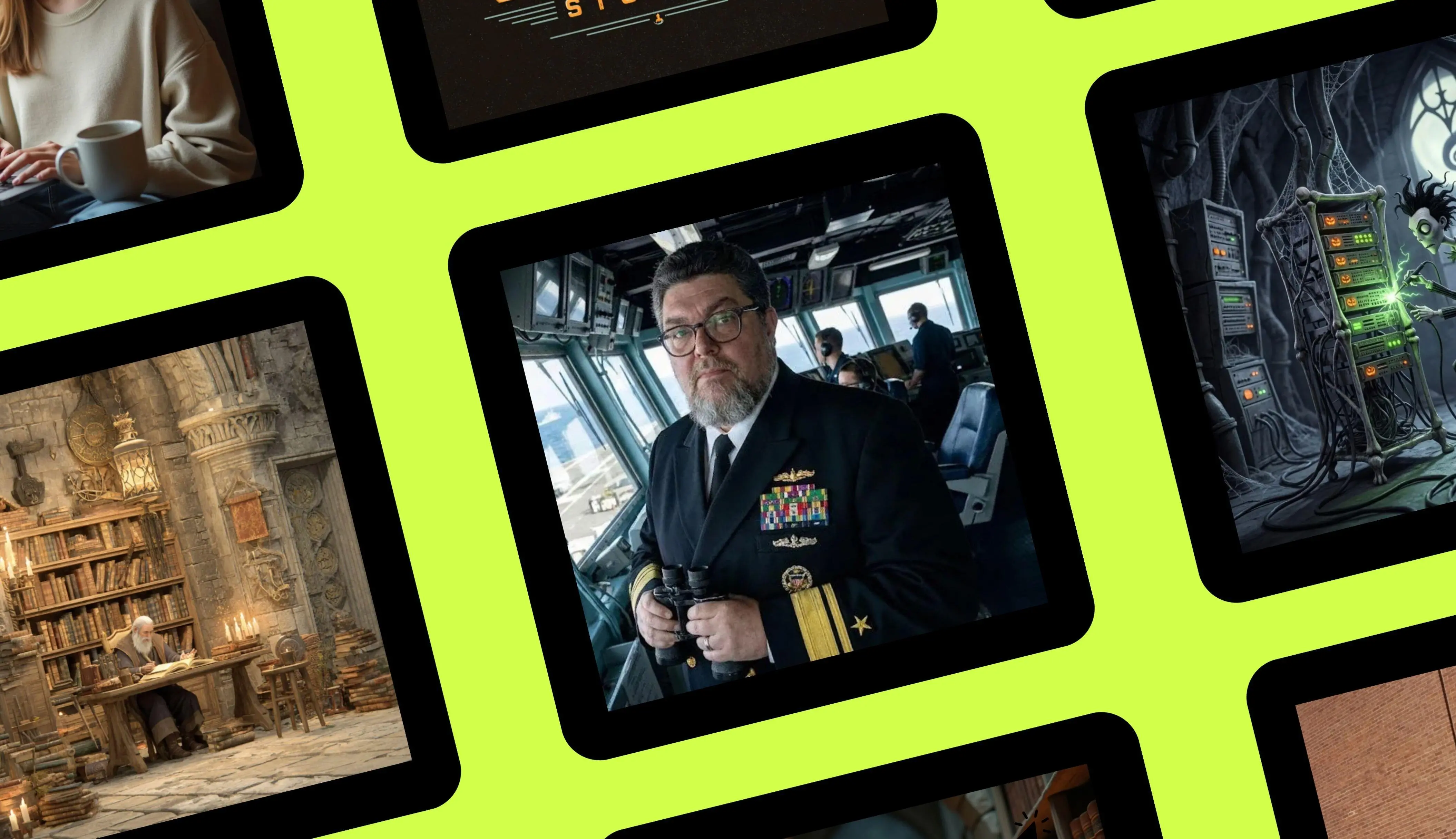
A new comparison of six paid AI image generators has produced an unusually lopsided result: Google's Nano Banana Pro, part of Gemini 3, finished first with a near-perfect score of 93%. ChatGPT placed second at 74%. Midjourney followed at 57%, Adobe Firefly at 54%, Leonardo AI at 52%, and Canva at 43%. The nine-prompt test covered photo recontextualization, restoration, original image creation, text placement, and pop-culture references. Every image was generated in a 1:1 square ratio so results could be compared side by side.
Key facts at a glance
- Google Nano Banana Pro: 93%, $19.99 per month as part of Google AI Pro.
- ChatGPT: 74%, $20 per month as part of ChatGPT Plus.
- Midjourney: 57%, $10 per month for Midjourney Basic.
- Adobe Firefly: 54%, $9.99 per month as part of Firefly Standard and included in many Adobe plans.
- Leonardo AI: 52%, $10 per month and also available through a Canva Business plan.
- Canva: 43%, $15 per month for Pro or $20 per month for Business, which includes Leonardo.
- All six tools were tested with the same nine prompts and source images.
- The reviewer paid for every subscription used in the test.
The result is striking because most AI tool comparisons find a cluster of capable products separated by small margins. This test did not. Nano Banana Pro was the only tool to score above 80%, and its lead over ChatGPT was 19 percentage points. The gap was even wider over the rest of the field. The review described the result as a no-contest knockout and said the practical buying advice is simple: if serious AI image generation matters, the $20 monthly Gemini 3 subscription is the one to get.
The test was not a casual sampling of pretty pictures. It used a fixed suite of nine prompts, the same source images where applicable, and a spreadsheet-based scoring system. Points were assigned for specific requirements such as preserving a face, adding the right clothing, cleaning up image damage, rendering readable text, and respecting the requested era or cultural reference. The categories were revising existing images, generating original images, adding text to images, and leveraging pop culture. That structure mattered because it exposed weaknesses that a single artistic prompt would have hidden.
How the nine-prompt test worked
The first prompt asked each tool to dress a man in a US Navy admiral's uniform and place him on the bridge of an aircraft carrier without changing his face. This tested photo recontextualization: the ability to take an existing subject and move him into a completely different scene while keeping his identity intact. Points were awarded for the background, the new clothing, and whether the original face and source details survived.
The second prompt asked for restoration of an old black-and-white photograph. The instructions called for repairing scratches, dust, stains, and cracks while improving sharpness, clarity, contrast, and lighting without over-smoothing. The AI had to preserve facial features, textures, and period details. A third prompt added colorization, asking the tool to restore an old black-and-white image of a truck, remove damage, sharpen details, and add historically plausible colors while keeping the original composition and the text on the truck readable.
The remaining prompts tested creative and commercial work. One asked for a retro-futuristic logo for a video studio named Space Coast Studios. Another asked for a fantasy scene of a medieval librarian in a candlelit stone library. Two social-media prompts requested a photorealistic studio portrait of a stylish senior adult holding a flagship smartphone, and a candid portrait of a student using a MacBook Pro next to a cup of coffee. Both required specific ad copy to be placed on the image.
The final two prompts tested pop-culture handling. One asked for a poster for a fictional fourth Back to the Future movie in which Marty McFly takes the DeLorean and his skateboard to 1920s New York City. The other asked for a Nightmare Before Christmas-style, Tim Burton-style image of an IT professional in a data center. These prompts tested cultural fluency, copyright handling, text rendering, and the ability to match a distinctive visual style.
Google Nano Banana Pro: the clear winner
Score: 93% | $19.99 per month as part of Google AI Pro
Nano Banana Pro aced almost every test. In the admiral prompt, it kept the subject's face and glasses, changed the angle he was facing, placed him properly on the bridge of a ship, and added binoculars to his hands. The result was not a generic uniform swap; it was a coherent recontextualization. The tester noted a minor realism issue involving Navy personnel and beards, but the image still met the assignment.
The photo-restoration tests were also strong. When given an old, dark childhood photo, Nano Banana Pro produced a clean, visible version that preserved the original face. It also handled a truck colorization job well enough that most of the lettering was accurate and readable. There was an error: the truck text came out closer to 'BADICLOGICAL DEFEKSE' than the intended 'RADIOLOGICAL DEFENSE.' The tool also produced a wrong image in one session before eventually completing the truck assignment, which cost it points. And it adds a watermark in the bottom corner of each image, an annoyance for anyone who wants clean output.
Even with those deductions, Nano Banana Pro dominated the creative categories. Its Space Coast Studios logo included a palm tree, a rocket, film imagery, and accurate text. Its medieval librarian image delivered candles, candlelight, and stone walls. Its social-media images placed text properly, fit the copy cleanly over the image, and avoided the garbled lettering that tripped up several competitors. The senior adult was holding what was clearly an iPhone even though the prompt asked for a flagship smartphone, a detail the tester found amusing rather than disqualifying.
The pop-culture results were the strongest single argument for the tool. The Back to the Future poster included the DeLorean, the skateboard, and a period-appropriate Marty in 1920s clothing. The text evoked the film logo and placed 'New York City 1925' on a marquee in a style that matched the era. It added the tagline 'The Roaring Twenties Got Heavy,' a line that referenced both the decade and one of Marty's favorite phrases. The Nightmare Before Christmas-style IT image also worked. Across the full suite, the only significant issues were the session mix-up, the truck lettering error, and the watermark.
ChatGPT: second place and best for natural-language iteration
Score: 74% | $20 per month as part of ChatGPT Plus
ChatGPT finished second, but it was far behind the leader. Its strength is natural-language iteration: users can describe changes conversationally, ask for revisions, and keep refining an image in the same chat. That makes it useful for people who want to think out loud with the model rather than write a single perfect prompt.
Photo retouching was not a strength. The admiral recontextualization preserved the face well, but the uniform insignia were unclear and looked like a strange cross between a lieutenant and an O-8 admiral. The childhood photo restoration was good and kept the original face. The truck cleanup was better than the previous version, but the lettering changed from 'RADIOLOGICAL DEFENSE' to 'RADIO CHEMICAL DEFENSE' with an extra space. The logo was usable but lacked Florida, palm tree, or sun references. The librarian prompt produced an expected result with no points lost.
The social-media posts were almost fine. The text was correct, but both blocks were placed in exactly the same position. Moving the text up on the portrait of the man would have been a better design choice. Lighter font style and poor contrast also made the text harder to read, costing a point on each image. In pop culture, ChatGPT was unpredictable. One earlier test recreated a Star Trek scene and duplicated an alien creature convincingly. But when asked for Back to the Future and Nightmare Before Christmas images, the tool returned something that lost a large number of points. That inconsistency pushed the new image generator's ranking from 81% for the previous version down to 74%.
Midjourney: best for hyper-creative cinematic imagery
Score: 57% | $10 per month for Midjourney Basic
Midjourney remains a powerful tool for originating creative imagery. It is especially good at mood, composition, and cinematic style. When it works, it produces images that feel art-directed rather than assembled. The medieval librarian image was almost exactly what the prompt described. The Nightmare Before Christmas-style IT image was a favorite: it captured the data-center environment and the Tim Burton feel with a photorealistic, Lurch-like character.
But Midjourney struggled with editing, recontextualization, and text. In the admiral test, it reproduced a yellow shirt and some background from the original, but the man was not the same person, and a ship appeared in a park for no clear reason. The childhood photo was not cleaned up and arguably looked worse. The truck image included a truck, but not the original truck, and added a young woman who looked like a Star Trek captain. All three images were delivered in 1:1 format, but they looked as if they had been slapped onto a square canvas.
The logo prompt produced correct text and a palm tree, along with towers that could suggest space. It was evocative but would have benefited from a rocket. The social-media images looked real, but Midjourney did not render the requested text at all. In the Back to the Future poster, the city looked too neon for 1920s New York, and the lack of text cost points. The Marty character was not a Michael J. Fox lookalike, but the overall look was close enough that the tester did not deduct points for likeness.
Adobe Firefly: best for commercial-safe images
Score: 54% | $9.99 per month as part of Firefly Standard
Adobe Firefly is designed to be commercially safe, and that caution showed. It was the most uncooperative and fussy tool in the test from a copyright perspective. When the tester tried to upload a photo of himself wearing a Star Trek-inspired Gorn T-shirt, Firefly refused the upload. He had to use Nano Banana Pro to remove the shirt graphic before Firefly would accept the image. That kind of friction may be acceptable for brand-safe commercial work, but it slows down experimentation.
The admiral image barely qualified as an admiral's uniform, and the face was not the original subject. The childhood photo transformation was good and easy to see. The truck colorization looked great, but Firefly did not clean up the image artifacts, which was the main point of the assignment. The logo was usable. The librarian image had an uncanny-valley face that looked like AI from an earlier generation.
The social-media prompts triggered an unexpected error. Firefly complained that including artist names in the prompt did not meet its user guidelines, even though no artist name was present. The trigger was the phrase 'Facebook-style.' Once that phrase was removed, the images generated. The senior adult image had a blurred face that could be defended as an artistic choice, but the spelling was wrong. The student image had subtle errors in the shirt, arm, and hands. Firefly also refused to generate the pop-culture images, which cost it more points.
Leonardo AI: best for fantasy art
Score: 52% | $10 per month, also part of Canva Business
Leonardo AI completely failed the tests involving existing images. It refused to engage with that part of the assignment. The tool performed better with original creative work. Its logo was workable, though it did not lean into the Space Coast theme with sun, palm trees, and a rocket. Its librarian met the prompt because neither gender nor age was specified.
The social-media images had odd anatomical and spatial errors. The man's left inner elbow looked strange. The woman's leg seemed to wrap around the laptop, and she was balancing a cup of coffee on her leg. In the Back to the Future prompt, Leonardo was the first tool to actually format a poster, which was a genuine strength. But the poster advertised sequels four through 10, included the gibberish text 'HAMY JOB OARY OF DOSE,' and placed cars and buildings that were decidedly not from the 1920s. The
Source: ZDNET News